
Monochrome Muscles
30 Days in Black-&-White: the street-photography workout that reshaped my eye — and will super-charge yours too.

Boston in June is a confetti-storm of color: Flowers blooming, sun beaming every morning, and brick row-houses glow terracotta at golden hour.
So why did I spend the entire month stripping every frame back to black-and-white? Because when hue disappears, what’s left is the raw anatomy of an image—light, shadow, shape, gesture. Thirty days of that discipline felt like trading my creative dumbbells for barbells: heavier, harder, but wildly more rewarding.
This blog is a field report from that self-imposed bootcamp — what went right, what surprised me, and why flexing your own monochrome muscles might be the fastest way to level-up, whether you shoot with an iPhone or a Leica.
“Photographing in black and white offers me a sense of distance — a distance from real life.”
Why Train your Eye in B&W?
That “distance” is exactly why I plunged into 30 straight days of monochrome. Images can transcend time when an image loses its color. A street scene taken in 2025 can suddenly feel as if it could have been shot in 1955 or 2055.
Additionally, with the distraction of hue gone, emotion and details tend to pop more. A single tear catches hard window-light, a clenched fist cuts starkly against a mid-tone sky, an interesting crack on the pavement. In color, those moments compete with reds and blues while in black-and-white they command attention.
Here’s how seeing in greyscale can re-wire any photographer’s vision:
Light becomes the story. No more relying on color contrast; you start tracking how a shaft of sun slices through an alley, echoing Fan Ho’s mantra that light is a photograph’s “soul.”
Contrast = composition. Bright whites pull the viewer in; deep blacks anchor the gaze. As street-shooter Alan Schaller says, forcing B&W “makes you pay attention to texture and tone before anything else.”
Emotion cuts deeper. Strip away color theory and viewers lock onto body language, gesture, atmosphere—making each frame feel more timeless and direct.

B&W photography helps make an image timeless and can help appreciate the mundane details of every day life.
Seeing Double: When Color wins or B&W rules
Below are photos with my opinion on why I think color or B&W edits work.
Example 1: Patio Pot and Umbrella

Color wins – Diffuse midday light leaves the B&W version flat; no deep shadows to carve shape. The magenta umbrella and purple blooms supply the needed contrast and draw the eye to the hanging pot.
Example 2: Archway Architecture

B&W wins – Neutral stone and cloudy sky feel washed in color. In B&W, concrete texture and rhythmic arches pop; shadows create real depth.
Example 3: Tokyo Tower

Color wins – The image hinges on the punch of red steel against cobalt sky. Remove hue and the iconic landmark flattens into the mid-grey sky, with little contrast to help separate the tower from the background.
Example 4: Courtyard Contemplation
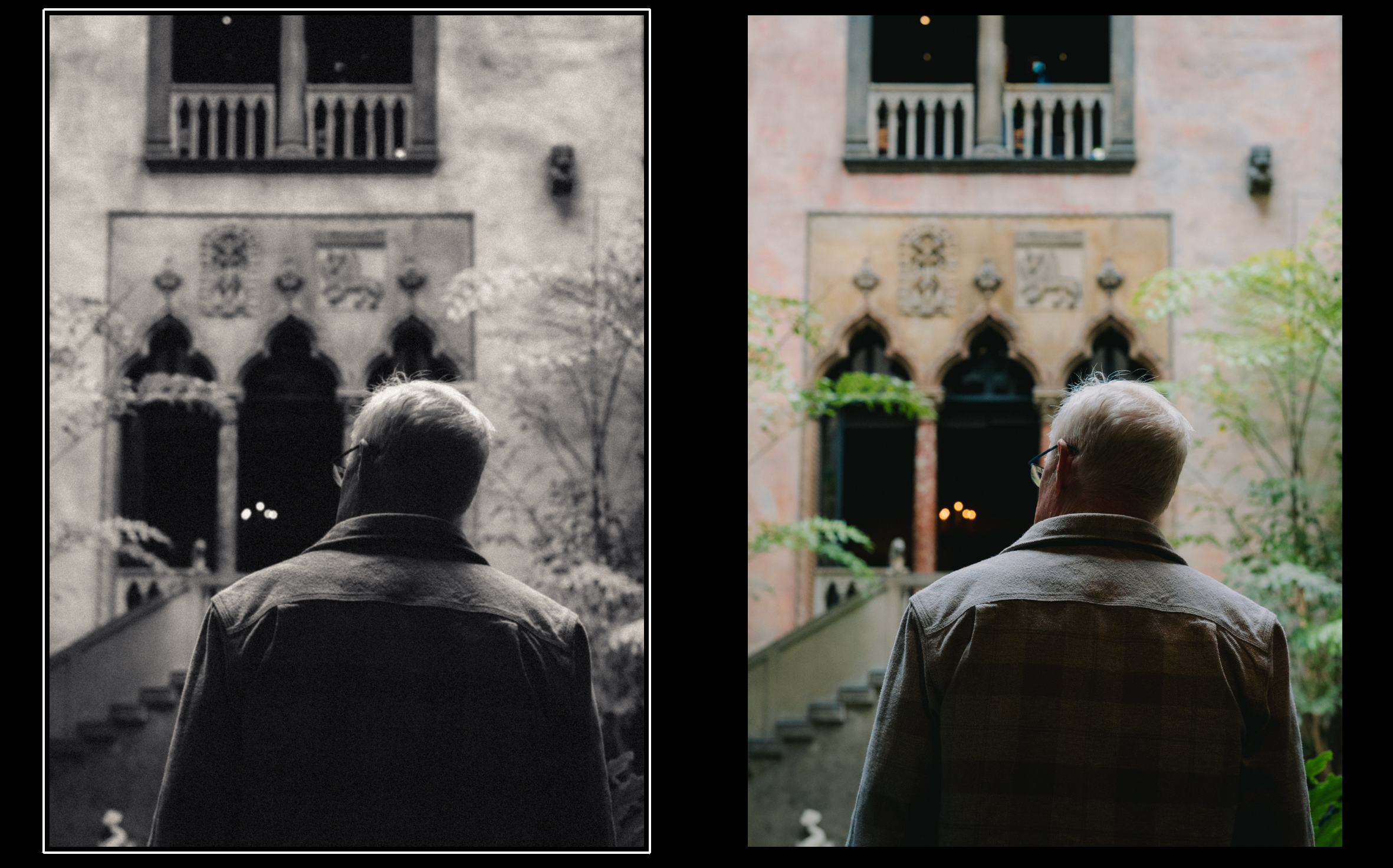
Tie - In my opinion, both images work depending on the message being conveyed. B&W spotlights the man’s silhouette and deepens the feeling of solitude. Color connects him to the weathered façade and subtle greenery, telling a richer place-based story.
Ask first, edit second. Before touching a saturation slider, ask What makes this frame sing?
If it’s color contrast—like Tokyo Tower or the patio blooms—let color lead. If it’s light, texture, or geometry, strip the spectrum and see if the story speaks louder in monochrome.
And remember: B&W can’t rescue a weak composition; editing (be it color or monotone) should turn a good image into a great one, not perform CPR on a lost cause.
My 30 days of Monochrome
Deep Diving into My Three Favorite Images Taken this Month

Pool-Edge Reflection
What worked: Abstract textures & tonal range. The day was fairly sunny with plenty of harsh lighting. This image takes advantage of the contrast setting to really appreciate the details and reflections in the pool. The image itself is nothing surprising or groundbreaking, yet the greyscale turned this shot into a minimal abstract shot.
Take-away: B&W can turn everyday surfaces into graphic art. Great for those longer focal length shots.

Heads-Down at the Cloisters
What Worked: Layered depth & posture cue emotion. B&W allows a stronger emphasis on the symmetry and composition of the image with the 2 subjects flanking the central subjects. The emotional serenity of the subjects is amplified with the absence of color.
Take-away: B&W lets body language outperform color distractions and can highlight composition.

Courtyard Daydream
What worked: Figure-in-frame, 90 % negative space. Strong sub framing and contrast created by the sunlight hitting the front of the subject. I have a color version of this shot, and while the scene also worked in color, the B&W amplified the composition of this image. The usage of negative space also accentuates the subject and lighting.
Take-away: Hard side-light + deep blacks = instant mood
Shooting & Editing — Your Fast-Track B&W Playbook
“A good monochrome frame should sing across the whole piano—deep bass blacks through bright treble whites.”
I’ve split this finale into two bite-sized blocks: field tips (how to capture stronger B&W in-camera) and editing tips (my go-to Lightroom touch ups to boost B&W shots).
Field Tips
Switch your EVF/LCD to a monochrome preview
Compose in tone, not color; you’ll spot shapes and light faster.
Hunt directional light
Side-light sculpts texture; back-light gives dramatic silhouettes.
Expose for the highlights
Dial exposure down until bright areas hold detail—shadows can be lifted later.
Lean into texture & repetition
Brickwork, foliage, ripples become the drama once hue is gone.
Skip color-centric subjects
If the story is the rainbow (e.g. flowers, clothing, neon signs), shoot in color instead.
Editing Tips

Below are some of my common edits done in post that tend to enhance my B&W photography.
Convert to Monochrome → Profile ➜ Adobe Monochrome
Protect highlights → Highlights − 25 to − 40
Recover mid-shadows → Shadows + 25 to + 40
Anchor true blacks / true whites
Blacks − 40 to − 60
Whites + 5 to + 15
Add a gentle S-curve in the Tone Curve panel for extra contrast snap.
Sprinkle tactile grain → Grain 20-30 / Size ≈ 25 / Roughness ≈ 40
(Optional) Soften edges → Clarity − 5 to − 10 for a more filmic feel.
Pro Tip: Save these moves as a preset called Full-Scale Mono; apply on import, then fine-tune per frame. Presets serve as a starting point and should always be refined for every shot.
Closing Thought — Flex the Muscle, See the Light
Black-and-white isn’t a vintage filter or a trendy preset; it’s a workout for your eyes. A month of living in greyscale forced me to strip every frame down to its essentials—light, shadow, shape, gesture—and the payoff showed up even when I switched back to color. Above all, this month proved to me one truth: choose your palette on purpose. If hue is the hero, let color roar. If mood, geometry, or texture carry the story, silence the spectrum and let tone sing across the full piano.
So here’s your invitation, no matter where you sit on the creativity scale:
If you’re not a photographer (yet)
Grab your phone, set it to a mono filter, and spend five minutes photographing everyday scenes: morning coffee steam, sidewalk shadows, your dog’s fur.
Post one frame with #MonochromeMuscles and note what you felt first: light or color? You’ll start noticing both in every corner of daily life.
If you already shoot regularly
Give yourself a one-roll / one-card B&W challenge this weekend. Expose for highlights, protect your blacks, and chase side-light like it owes you money.
Back home, ask yourself “what am I trying to tell with this shot?” and edit to enhance that story; focus on widening that tonal scale until the histogram touches both walls. Your colour work will tighten automatically.
Tag me in your first #MonochromeMuscles post on Instagram (@framesbyalm).
Until then, keep chasing light—whether it glows in technicolor or whispers in black-and-white.
Saludos!
-A
Update:
My new photo zine is now available for purchase! Solo in the Smoke is a visual diary that documents my week in London and celebrates the beauty and confidence that stem from solitude.
You can purchase the Digital Edition through La Tiendita or the Limited Edition Hardcover through Blurb.